
Avoid These Trust-Busting Mistakes That Could Be Hurting Your Conversions
Your website is your business’s digital handshake—and let’s be honest, nobody trusts a sweaty, awkward handshake. First impressions online happen in milliseconds, and if your website gives off the wrong vibe, your visitors might bounce before they even read your first sentence. Contact us today!
🎧 Prefer to Listen? If you’d rather consume this as an interactive walkthrough or audio version, listen below:
Here are 10 web design red flags that instantly scare away potential customers—and what to do instead.
1. Auto-Play Music or Video
Why it’s scary: Loud, unexpected sounds feel like jump scares in a quiet room.
What to do: Let users choose when to hit play. Always.
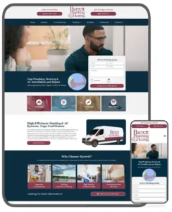
2. Outdated Design (Hello, 2008!)
Why it’s scary: Old-school fonts, Flash intros, and neon buttons scream “we stopped updating in 2013.”
What to do: Refresh your design every 3–5 years with modern, responsive elements.

3. Not Mobile-Friendly
Why it’s scary: Over half of web traffic is mobile. If your site isn’t responsive, users bounce fast.
What to do: Use responsive design frameworks and test on various devices.
4. Slow Load Times
Why it’s scary: Visitors will ghost you if your site takes longer than 3 seconds to load.
What to do: Compress images, use caching, and upgrade your hosting if needed.
5. No Clear Contact Info
Why it’s scary: A missing phone number or address triggers scam vibes.
What to do: Add clear, visible contact options and an easy-to-find “Contact Us” page.

6. Broken Links & 404 Errors
Why it’s scary: Dead links signal neglect and hurt your SEO and user trust.
What to do: Regularly audit your links and set up a custom 404 page with helpful navigation.
7. Confusing Navigation
Why it’s scary: If users can’t find what they need, they’ll leave frustrated.
What to do: Keep menus simple and logical. Use sticky headers and clear CTAs.
8. Low-Quality Images
Why it’s scary: Grainy, pixelated, or overused stock photos feel unprofessional.
What to do: Invest in high-res images or custom photography that reflects your brand.
9. Walls of Text
Why it’s scary: Big blocks of text are overwhelming and scream “TL;DR.”
What to do: Break content into short paragraphs, bullets, and use visual hierarchy.
10. No Trust Signals
Why it’s scary: No testimonials, reviews, certifications, or SSL = zero credibility.
What to do: Add badges, client logos, Google reviews, and secure checkout signs.

Final Thoughts
Your website is your best salesperson—if it’s not working 24/7 to build trust and convert visitors, it might be working against you.
Avoid these red flags and you’ll turn that digital handshake into a solid relationship (and more sales).
Need a website makeover that customers actually trust?
Let’s chat. We design fast, mobile-friendly, and high-converting websites for businesses in Rhode Island and beyond. Contact us today!