Why Your CSS Needs to Think Mobile First
Mobile first css is a design and development approach where you write your base CSS styles for mobile devices first, then use media queries with min-width to progressively add styles for larger screens like tablets and desktops.
Quick Implementation Guide:
- Write base styles for the smallest screens (mobile phones) without any media queries
- Use
min-widthmedia queries to add complexity for larger viewports - Include the viewport meta tag in your HTML:
<meta name="viewport" content="width=device-width, initial-scale=1.0"> - Test on real devices to ensure your mobile experience works properly
Your website probably looks great on your desktop. But here’s the hard truth: over 60% of web traffic comes from mobile devices. Even more critical? Google primarily uses the mobile version of your site for indexing and ranking. If your site isn’t built mobile-first, you’re fighting an uphill battle for visibility.
The problem isn’t just about looking good on phones. Desktop-first CSS often creates bloated, slow-loading mobile experiences. You end up writing styles for desktop, then trying to undo or override them for mobile. It’s backwards. It’s inefficient. And it’s costing you customers.
Mobile first css flips this approach. You start simple. You build for the constraints of a small screen first. Then you progressively improve for devices with more screen real estate. The result? Faster load times, cleaner code, and better user experiences across all devices.
I’m Jeff Pratt, owner of JPG Designs, and my career has been dedicated to helping businesses build high-converting websites that work beautifully on every device. Throughout my career, I’ve guided countless clients through the transition to mobile first css, changing their slow, desktop-heavy sites into lean, mobile-optimized experiences that rank better and convert more visitors into customers.

The Foundational Shift: Mobile-First vs. Desktop-First
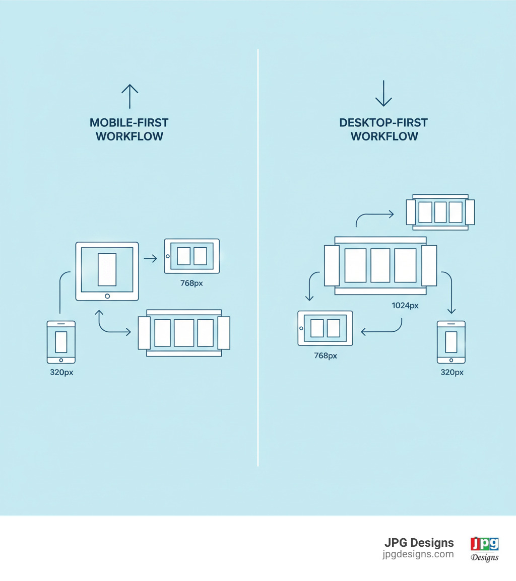
Here’s where things get interesting. Mobile first css is built on a core principle called progressive improvement. Instead of starting with a complex desktop design and trying to squeeze it down for phones, you begin with the simplest, most essential version of your site—the mobile view. Then, as you get more screen space, you progressively layer on additional features and complexity.
Think of it like cooking. You start with your essential ingredients, taste as you go, and add seasonings gradually. You don’t throw everything in at once and then try to fish out what doesn’t work. That’s messy. That’s what desktop-first does.
The old way—desktop-first—relied on something called “graceful degradation.” Sounds fancy, right? In practice, it meant building a beautiful, complex desktop site and then stripping things away or overriding styles to make it work on mobile. The problem? Mobile users often got stuck with bloated stylesheets full of code they’d never use, plus all the override code trying to undo the desktop complexity. It’s like wearing a winter coat in summer because you started your day in the cold.
Let’s put these two approaches side by side:
| Feature | Mobile-First CSS | Desktop-First CSS |
|---|---|---|
| Core Principle | Progressive Improvement (start simple, add complexity) | Graceful Degradation (start complex, simplify) |
| Base Styles | Mobile styles are the default | Desktop styles are the default |
| Media Queries | Primarily min-width (add styles for larger screens) |
Primarily max-width (override styles for smaller screens) |
| Code Complexity | Often simpler, less override code | Can lead to more complex overrides and redundancy |
| Performance | Generally faster on mobile (less CSS to parse) | Can be slower on mobile (more CSS to parse/override) |
| Maintenance | Easier to manage and scale | Can become cumbersome with many overrides |
| SEO Impact | Aligns with mobile-first indexing, better rankings | Can negatively impact mobile experience and SEO |
One of the beautiful side effects of mobile first css is how naturally it encourages fluid layouts. When you default to a single-column, full-width approach for mobile, your design becomes inherently flexible. Elements stack naturally and fill the available space. As screens get bigger, you’re adding structure, not fighting against rigid desktop assumptions. For more on creating these responsive experiences, we’ve got you covered.
Why Mobile-First Wins for Performance and SEO
Here’s a reality that should make any business owner sit up and pay attention: a significant majority of web traffic comes from mobile devices. If your site isn’t optimized for these users, you’re essentially turning away most of your potential customers at the door.
Mobile first css solves real problems that are costing businesses money right now.
Faster load times on mobile happen because we’re forced to prioritize what matters. Less CSS for mobile devices to parse means faster rendering. And speed matters—websites that load in 3 seconds or less see roughly double the conversions compared to slower sites. When you start mobile-first, you’re building lean by default.
Better user experience naturally follows. We’re talking readable text without pinching and zooming. Navigation that works with thumbs, not mouse cursors. Interactive elements sized for actual human fingers. This isn’t just nice to have—it’s essential when you consider that a huge percentage of mobile sites still struggle with basic usability.
Here’s the big one: Google’s mobile-first indexing. Google primarily uses the mobile version of your content for indexing and ranking now. Not desktop. Mobile. If your mobile site is slow, clunky, or incomplete, it directly hurts your visibility in search results. This affects businesses everywhere, from Providence to Newport and beyond. Mobile first css isn’t just a trendy approach—it’s an SEO necessity. For a deeper dive, check out our guide on Google’s indexing changes.
Reduced code redundancy is another huge win. You’re not writing desktop styles, then overriding for tablet, then overriding again for mobile. You build up progressively, adding only what’s needed at each breakpoint. Less repetition means smaller file sizes and faster downloads.
All of this leads to cleaner, more maintainable code. When you need to update something six months from now, you’re working with a logical, layered structure. Not a tangled web of conflicting overrides where changing one thing breaks three others.
It’s worth noting that the term “responsive design” was coined by Ethan Marcotte in 2010, and while the concept has matured over the years, the core idea remains the same: websites should adapt to any screen size. Mobile first css takes that philosophy and turns it into a practical, strategic methodology.
Understanding the Viewport Meta Tag
Before you write a single line of CSS, there’s one tiny piece of HTML that’s absolutely essential for responsive design. It’s called the viewport meta tag, and without it, mobile browsers might try to “help” by rendering your page at desktop width and zooming way out. This completely undermines your responsive efforts.
Here’s what you need in the <head> section of every HTML page:
<meta name="viewport" content="width=device-width, initial-scale=1.0">
Let me break down what this does. The width=device-width part tells the browser to set the viewport width to match the device’s actual width in device-independent pixels. On an iPhone, that’s 375px, not the thousands of physical pixels the screen actually has.
The initial-scale=1.0 part sets the zoom level when the page first loads. A value of 1.0 means no zooming—your content displays at its intended size, exactly as you designed it.
This one line of code is your handshake with mobile browsers. You’re telling them, “I’ve got this. I’m responsive. Trust my layout.” It prevents mobile browsers from trying to outsmart your carefully crafted design. You can read more about the viewport meta tag on Mozilla’s developer documentation if you want the technical deep dive.
How to Write Effective Mobile-First CSS
Here’s where the rubber meets the road. You understand why mobile first css matters—now let’s talk about how to actually write it. The good news? It’s more straightforward than you might think.
The fundamental principle is simple: your base styles target mobile devices without any media queries whatsoever. Everything you write outside of an @media block applies to all screens by default, but it’s specifically optimized for the smallest viewports. This is where you define your core typography, colors, spacing, and that beautiful single-column layout that works perfectly on phones.
Think about it this way: your mobile styles are your foundation. They’re the essential version of your website—clean, focused, and fast. No clutter, no unnecessary complexity. Just the content your users need, styled in a way that works on a 320px screen.
Then, as screens get bigger, you use min-width media queries to layer on additional styles. You’re saying, “Hey, if there’s at least this much space available, let’s add these improvements.” You’re not fighting against your mobile styles or trying to undo them. You’re building up, not tearing down.

This progressive approach keeps your code lean for mobile users. They only download and parse the CSS they actually need, which means faster load times and happier visitors. And here’s a bonus: this structure makes your stylesheets way easier to maintain. When you need to update something, you’re working with a logical, layered system instead of a tangled web of overrides. For more insights on creating exceptional experiences across all devices, check out our guide on responsive web design.
The Core of Mobile-First CSS: Using min-width Media Queries
If mobile first css has a secret weapon, it’s the min-width media query. This is what allows you to progressively add complexity as screen size increases. The query essentially says, “Apply these styles only when the viewport is at least this wide.”
Let’s look at a real-world example that I see clients struggle with all the time: creating a two-column layout. On mobile, you want everything stacked vertically—main content on top, sidebar below. On larger screens, you want them side by side. Here’s how we handle that:
/* Base styles for mobile (default, no media query) */
.container {
  width: 100%;
  padding: 1rem;
}

.main-content {
  width: 100%;
  margin-bottom: 1rem; /* Space between content and sidebar on mobile */
}

.sidebar {
  width: 100%;
  background-color: #f0f0f0;
  padding: 1rem;
}

/* Tablet and larger (e.g., 768px minimum width) */
@media (min-width: 768px) {
  .container {
    display: flex; /* Use flexbox for layout */
    gap: 2rem; /* Space between main content and sidebar */
  }

  .main-content {
    width: 66%; /* Main content takes 2/3 width */
    margin-bottom: 0; /* No bottom margin when side-by-side */
  }

  .sidebar {
    width: 33%; /* Sidebar takes 1/3 width */
  }
}
See what’s happening here? The mobile version is dead simple—everything’s 100% width and stacks naturally. No tricks, no hacks. Then at 768px (a common tablet breakpoint), we introduce flexbox and adjust the widths. We’re enhancing, not overriding. That’s the beauty of progressive improvement.
Now, you might be wondering about breakpoints. While every project is different (and you should always design for your content, not arbitrary device sizes), here are some common starting points: small devices (phones) use your base styles with no media query, medium devices (tablets) typically start around min-width: 768px or 600px, large devices (desktops) might kick in at min-width: 992px or 1024px, and extra large screens could begin at min-width: 1200px or higher.
The CSS-Tricks guide to media queries is an excellent deep dive if you want to explore all the possibilities beyond just min-width.
Advanced Mobile-First CSS: Handling Complex Layouts
Most of the time, min-width media queries are all you need for mobile first css. But sometimes—especially with complex layouts—you need more precise control. What if you want a style to apply only within a specific range, not from that breakpoint onwards forever?
Let me give you a practical example that comes up frequently: a multi-column card gallery. On mobile, you want one column. On tablets, two columns. On desktops, three columns. But on really massive screens, you don’t want the cards stretching out ridiculously wide—you want to cap things.
Here’s how we handle that kind of complexity:
/* Base styles for mobile (1 column) */
.gallery {
  display: grid;
  grid-template-columns: 1fr; /* Single column */
  gap: 1rem;
}

/* Tablet (2 columns) */
@media (min-width: 600px) {
  .gallery {
    grid-template-columns: repeat(2, 1fr); /* Two columns */
  }
}

/* Desktop (3 columns) */
@media (min-width: 992px) {
  .gallery {
    grid-template-columns: repeat(3, 1fr); /* Three columns */
  }
}

/* Limiting specific styles for very large screens (e.g., above 1400px) */
@media (min-width: 992px) and (max-width: 1400px) {
  .gallery-card {
    /* Maybe reset some margin that was applied at a larger breakpoint, or add specific styles */
    margin-bottom: 1.5rem;
  }
}

/* Or, more commonly, use a min-width for the max size of the container itself */
@media (min-width: 1400px) {
  .gallery {
    max-width: 1200px; /* Cap the max width of the gallery */
    margin: 0 auto; /* Center it */
  }
}
Notice how we’re still primarily using min-width queries to progressively add columns. The combination of min-width and max-width in the middle query lets us target a specific range when needed. But more commonly, we handle very large screens by simply capping the container width itself—much cleaner and easier to maintain.
The trick is avoiding what I call “style leaks”—when a style you wrote for tablets accidentally affects your desktop layout in weird ways. Sometimes you need to explicitly reset a property (like removing a margin that made sense on tablets but looks wrong on desktop) to keep everything looking sharp. This combination of techniques gives you surgical precision while keeping your code clean and maintainable.
Modern Techniques and Best Practices
Writing effective mobile first css isn’t just about using min-width media queries—it’s about embracing a holistic approach that puts mobile users at the center of every decision. Over my years building websites for clients across Rhode Island and beyond, I’ve learned that the most successful mobile-first projects follow a consistent set of principles that go beyond basic responsive breakpoints.
Start with content prioritization. Before you write a single line of CSS, ask yourself: what does a mobile user absolutely need to see first? What’s essential, and what can wait? This mindset shift is crucial. When you’re designing for a 375px screen, you can’t fit everything above the fold. You have to make choices. Identify your most important content and functionality, then build your mobile styles around that core experience. Everything else can be revealed progressively as screen space increases.
Accept relative units instead of fixed pixels. When you use rem, em, percentages, and viewport units like vw, your designs naturally scale across different screen sizes. A button with padding: 1rem will feel appropriately sized on both a phone and a desktop without you needing to constantly adjust pixel values in media queries. This approach also respects user preferences—if someone has increased their browser’s default font size for accessibility, relative units honor that choice.
Think about responsive typography as more than just changing font sizes at breakpoints. You can create truly fluid type that scales smoothly with the viewport using calc(). For example, font-size: calc(1rem + 1vw); gives you text that grows naturally with screen size while still allowing users to zoom. This creates a more refined reading experience across all devices.
Optimize every interactive element for touch. This is where many desktop-first designs fail spectacularly. Buttons and links that work perfectly with a precise mouse cursor become frustrating tap targets on a phone. Make your clickable areas at least 44×44 pixels—the minimum comfortable size for a finger tap. Provide clear visual feedback when someone touches an element. These small details make the difference between a site that feels clunky and one that feels native to mobile.
Test on actual devices, not just emulators. I can’t stress this enough. Browser developer tools are fantastic for quick checks, but they don’t show you the real experience. How does your site feel when you’re holding it in your hand? Can you reach all the navigation with your thumb? Does scrolling feel smooth? We keep a collection of phones and tablets at JPG Designs specifically for this purpose, and we test every project across multiple devices before launch.
Beyond these core practices, consider how images affect your mobile performance. Use max-width: 100%; on images to prevent awkward overflow on small screens. For even better optimization, implement the <picture> element or srcset attributes to serve appropriately sized images to different devices. A mobile user doesn’t need a 3000px desktop hero image—serving them a 750px version cuts load time dramatically.
Lazy loading is another powerful technique for mobile performance. Images and videos below the fold don’t need to load immediately—they can wait until a user scrolls near them. This dramatically improves your initial page load time, especially crucial on slower mobile networks.
Finally, a mobile-first approach naturally encourages better accessibility. When you focus on logical content flow, clear navigation, and simple interactions, you’re building a site that works better for everyone—including users with disabilities. Ensure good color contrast, make your site fully keyboard navigable, and use proper semantic HTML. These practices benefit all your users while also improving your SEO.
Integrating with Modern Layouts: Flexbox and Grid
Here’s some great news: the modern layout tools we have in CSS today—Flexbox and CSS Grid—are inherently responsive. They were built for the multi-device web we live in. This means you can create sophisticated layouts with far fewer media queries than the old float-based techniques required.
Flexbox is your friend for one-dimensional layouts. Need a row of items that should stack on mobile but sit side-by-side on desktop? Flexbox handles it beautifully. The flex-wrap property is particularly powerful for mobile first css—it lets items wrap to the next line when there isn’t enough space, without you needing to explicitly define breakpoints for every scenario.
Here’s a practical example: imagine a container with multiple items that should stack vertically on mobile, then flow horizontally and wrap on larger screens:
/* Mobile base styles */
.flex-container {
  display: flex;
  flex-direction: column;
  gap: 1rem;
}

/* Tablet and up */
@media (min-width: 768px) {
  .flex-container {
    flex-direction: row;
    flex-wrap: wrap;
    justify-content: space-between;
  }
  .flex-item {
    flex: 1 1 calc(50% - 0.5rem);
  }
}
CSS Grid excels at two-dimensional layouts where you need control over both rows and columns simultaneously. The real magic happens when you combine grid-template-columns with auto-fit or auto-fill and the minmax() function. This creates grids that automatically adjust the number of columns based on available space:
/* Mobile base */
.grid-container {
  display: grid;
  grid-template-columns: 1fr;
  gap: 1rem;
}

/* Larger screens */
@media (min-width: 768px) {
  .grid-container {
    grid-template-columns: repeat(auto-fit, minmax(250px, 1fr));
  }
}
This code says: “Create as many columns as will fit, with each column being at least 250px wide but able to grow to fill available space.” The browser does the math for you. No more calculating exactly how many items fit at each breakpoint.
These modern layout tools simplify your mobile first css approach significantly. You’re writing less code, creating fewer brittle breakpoints, and building layouts that adapt more gracefully to the infinite variety of screen sizes out there. For more insights on creating truly responsive experiences, check out our guide on responsive web design.
The Rise of Container Queries
Traditional media queries have served us well, but they have a fundamental limitation: they only respond to the viewport size. What happens when you need a component to adapt based on its own available space, not the entire screen width? This is where container queries come in, and they’re genuinely transformative for component-based design.
Imagine you have a card component that appears in different contexts on the same page—sometimes in a narrow sidebar, sometimes in a wide main content area. With viewport media queries, you’d have to create complex, context-specific styles. With container queries, the card can adapt to its own space automatically.
Here’s how container queries work:
<div class="parent-container">
  <div class="card">
    <h2>Card Title</h2>
    <p>Some card content.</p>
  </div>
</div>
.parent-container {
  container-type: inline-size;
  container-name: card-wrapper;
}

.card {
  padding: 1rem;
  background-color: #fff;
  border: 1px solid #ddd;
}

@container card-wrapper (min-width: 400px) {
  .card {
    display: flex;
    align-items: center;
  }
  .card h2 {
    margin-right: 1rem;
  }
}
The @container rule checks the width of the parent container, not the viewport. When that container is at least 400px wide, the card switches to a horizontal flex layout. This creates truly portable components that work correctly wherever you place them.
So when should you use container queries versus traditional media queries? The answer is straightforward: use media queries for global layout decisions that depend on the overall viewport (like your main navigation, page structure, or grid systems). Use container queries for component-level adaptations that should respond to the component’s own available space. For more details on how Google’s mobile-first approach affects your site architecture, see our article on mobile-first indexing.
Container queries represent the next evolution in responsive design. They allow us to build components that are truly self-contained and adaptive, making our mobile first css even more powerful and maintainable. With widespread browser support, they are now an essential tool in modern web development.
Conclusion: Build for the Future, Build Mobile-First
Here’s the reality: building a website without mobile first css is like opening a store but locking the front door where most of your customers try to enter. The vast majority of web traffic comes from mobile devices. If your site isn’t built for them first, you’re turning away most of your potential customers before they even see what you offer.
Throughout this guide, we’ve walked through the fundamentals together: why mobile-first thinking beats the old desktop-first approach, how the viewport meta tag enables responsive design, and the practical magic of min-width media queries. We’ve explored advanced techniques for complex layouts, and covered how modern tools like Flexbox, CSS Grid, and container queries make building responsive sites easier than ever.
The payoff is substantial. Mobile first css delivers faster loading sites that rank better in Google’s mobile-first indexing. Your users get a smooth, enjoyable experience whether they’re browsing on a phone during their commute or researching on a desktop at home. This approach isn’t just about adapting to today’s mobile-dominant world—it’s about building a foundation that will serve your business for years to come.
At JPG Designs, we’ve helped businesses throughout Rhode Island—from Providence to Warwick, Cranston to East Greenwich—transform their online presence with mobile-first strategies. We’ve watched these sites climb in search rankings, load faster, and convert more visitors into customers. The difference is real, and it’s measurable.
Your website is often the first impression potential customers have of your business. Make it count on every device. We specialize in creating websites that don’t just look good—they perform, they rank, and they grow your business.
Ready to stop losing customers to slow, outdated mobile experiences? Get a professional mobile-first website design and give your business the competitive advantage it deserves. Your future customers are already searching on their phones. Let’s make sure they find you.


