
As a business owner, you’ve probably heard the term “Google ranking” thrown around, but do you fully understand its impact on your business? In today’s digital-first world, ranking well on Google is crucial for your success. Whether you’re a small business in East Greenwich, Rhode Island, or a growing enterprise looking to expand your reach, understanding Google ranking can be the key to unlocking more traffic, higher visibility, and ultimately, more customers.
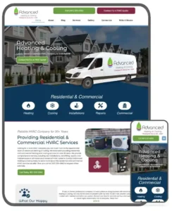
At JPG Designs, a web design and digital marketing company based in East Greenwich, we specialize in helping businesses not just build an online presence but also climb the ranks on Google. In this post, we’ll break down what Google ranking is, why it matters, and how a mobile vs. desktop ranking strategy could make a significant difference for your business.
What is Google Ranking?
Google ranking refers to the position at which your website appears in Google’s search results when someone searches for keywords related to your business. The higher your ranking, the more visible you are to potential customers. Google’s algorithms evaluate many factors to determine your rank, including:
- Content quality: How relevant and useful your website’s content is.
- Mobile-friendliness: Whether your website is optimized for mobile users (more on this in the next section).
- Local SEO: How well you have targeted local keywords to attract nearby customers.
- Backlinks: The number of reputable sites linking back to your website.
- Page load speed: Faster websites are ranked higher because they provide a better user experience.
- User engagement: How long visitors stay on your site and how they interact with your content.
At JPG Designs, we specialize in creating websites that not only look stunning but also perform well on Google’s ranking algorithms. With our knowledge of SEO best practices, we ensure your website is optimized to rank higher, bringing in more organic traffic.

Why Google Ranking is Important for Your Business
- Increased Visibility: Studies show that websites on the first page of Google search results receive the majority of clicks. If your website isn’t appearing in the top results, you’re missing out on potential customers who might be searching for products or services you offer.
- More Traffic: Higher Google rankings drive more organic traffic. By ranking higher for relevant search terms, your business will get more visitors who are actively looking for your services.
- Trust and Credibility: Consumers tend to trust businesses that appear at the top of search results. Higher rankings signal to potential customers that your business is credible and authoritative in your industry.
- Better Local Reach: For small businesses like those in East Greenwich, local SEO is crucial. Optimizing your website for location-based keywords can help you attract customers in your local area who are looking for the services you offer.
- Higher Conversion Rates: More visibility and more relevant traffic usually lead to higher conversion rates. A well-optimized site ensures that when visitors land on your page, they are more likely to take the desired action—whether that’s making a purchase, filling out a contact form, or calling your business.

Mobile vs Desktop: Understanding the Differences in Google Ranking
In today’s mobile-first world, Google places significant emphasis on mobile-friendliness when determining your ranking. With more than half of all web traffic coming from mobile devices, it’s essential to ensure your website is optimized for mobile users.
Here’s how mobile and desktop rankings differ:
Mobile Ranking
Google now uses mobile-first indexing, which means it primarily looks at the mobile version of your website when ranking your site. If your mobile site is slow, difficult to navigate, or doesn’t provide a good user experience, your ranking will suffer. For businesses in East Greenwich or any local area, having a mobile-friendly website can significantly improve local SEO and attract more nearby customers who are browsing on their phones.
Key Mobile Ranking Factors:
- Mobile-friendly design: Your website should be responsive, meaning it automatically adjusts to different screen sizes.
- Fast load times: Mobile users tend to be more impatient with slow-loading pages. A mobile-optimized site should load quickly, even on slower connections.
- Ease of navigation: Buttons and links should be easy to tap on a smaller screen. This reduces bounce rates and increases user engagement.
- Local SEO: Mobile users often perform “near me” searches (e.g., “restaurants near me” or “plumbers in East Greenwich”). Optimizing for local SEO on mobile can increase your visibility in these searches.
Desktop Ranking
While mobile ranking is essential, desktop ranking still plays a role in how your site is evaluated. Desktop users may be more likely to conduct detailed searches or explore multiple pages on your website, and this type of engagement can help boost your rank.
However, it’s important to note that Google is gradually putting more weight on mobile rankings. If your website isn’t optimized for mobile, your desktop ranking could also take a hit, as Google might penalize you for a poor mobile experience.
Key Desktop Ranking Factors:
- Content length: Desktop users often expect more detailed content, so longer, more informative pages can help improve rankings.
- Desktop-specific SEO: While mobile SEO focuses more on user experience, desktop SEO can place more emphasis on detailed keyword optimization and on-page SEO techniques.
- Visual appeal: Desktop users often spend more time on a website, so your site’s visual design and layout can have a greater impact on engagement and conversion rates.
Local SEO: How JPG Designs Can Help
If you’re a local business in East Greenwich, local SEO is crucial for standing out in your community. By targeting location-based keywords and optimizing your Google My Business profile, you can improve your chances of ranking higher in local searches.
Here are a few ways JPG Designs can help you with local SEO:
- Optimizing for location-based keywords: We’ll help you identify the best keywords for your business and ensure they’re used effectively on your website.
- Google My Business optimization: Setting up and optimizing your Google My Business profile increases your chances of appearing in the local 3-pack (the three businesses shown at the top of Google’s local search results).
- Creating local content: Publishing blog posts or landing pages that target local events, news, or topics can help boost your local ranking.
- Building local backlinks: We’ll help you build high-quality, local backlinks to improve your website’s authority in Google’s eyes.
Conclusion: A High Google Ranking is Within Your Reach
In a competitive digital landscape, Google ranking is more than just a number—it’s the key to attracting more customers and growing your business. Whether you’re focusing on mobile optimization, local SEO, or both, the team at JPG Designs in East Greenwich can help you create a website that not only looks great but also ranks well.
We understand the intricacies of Google ranking and the importance of a tailored approach to SEO. Our experts are ready to work with you to increase your visibility, drive more traffic, and help you achieve long-term business success.
Ready to improve your Google ranking? Contact JPG Designs today, and let’s start working on a website that delivers real results!