
Every business needs to have an online presence.
Whether you’re in the B2B or B2C space, you need to build a website to showcase and sell your products or services.
However, slapping together a website using a free platform, with themes and plugins, isn’t enough. To see real results, you should invest in professional website design.
A whopping 93% of people say they’d leave a website if it’s poorly designed, so the cost you incur from designing a quality website design is worth it.
Why is Website Design Crucial for Your Business?
With over 1.8 billion active websites in existence, your site needs to be unique to stand out.
This, among a few other reasons discussed below, is why it’s so important for your website to have a quality design.
A poorly designed website can lead to crawling issues, broken links, slow load speeds, and many other technical errors resulting in poor SEO. You can use an SEO analysis tool to check for and rectify errors on your website.
Web Design Helps You Build Trust With Your Audience
Another reason website design is essential to your business is that it sets the tone for how your customers perceive your brand.
How UX Affects Website Design
When embarking on a website design or redesign, you must consider user experience (UX). UX refers to the overall experience your visitors have as they navigate through your website. It’s an important aspect of website design as it contributes to your customers’ overall customer journey.
You should design your website in such a way that it’s easy and pleasurable to use. Failure to do so could result in high bounce rates. After they’ve left due to an unpleasant experience, getting them to revisit your website is next to impossible.
On the other hand, website design also influences UX. A poor design results in negative UX and vice versa.
As we look at the website design principles to help you drive sales, keep UX in mind. And make sure to avoid website design mistakes that could cause your conversions and sales to plummet.
7 Website Design Principles That Drive Sales
Ready to design a website that delights your customers so much they’ll loosen their purse strings? Let’s dive into the seven website design principles to help you drive sales.
1. Keep It Simple
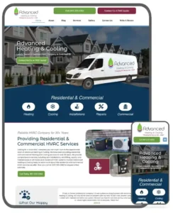
One of the most essential website design principles you must follow is to keep everything simple. It must be easy to scroll through and the content easy to read. Example:

Don’t overcomplicate your website in the name of being fancy. The point of a website is not to impress visitors. The main point of good website design is to convert visitors into customers. To do so, your website must present information in a simple and easy-to-understand way.
Adding too many elements, colors, or images only provides distractions that could potentially make your visitors forget the main reason they visited your website. Keeping it simple helps your visitors easily find their way around and helps increase your website’s conversion rates.
2. Consider White Space
An aspect of web design that’s easy to overlook is white space. Also called negative space, it’s the area between elements on a webpage. This could be elements like visuals, typography, icons, sections on a page, and more.
Research shows one of the biggest website design mistakes small businesses make is to overcrowd their web pages. Poor use of white space also topped the list.

White space balances the elements on a page and helps users better navigate the content.
However, one of the most significant benefits of white space in web design is that it gives your website a clean, minimalist look if used well. It’s aesthetically pleasing, easy on the eyes, and makes it easy for the brain to process the information on the page.
Another strategic use of white space is to help direct the flow of your content. White space is an active element of your pages that you should consider when designing your website.
Like all good things, however, too much white space can negatively impact your UX. Your website visitors won’t be too happy to scroll through half a page of nothingness. Not only can it be confusing, but it can also be frustrating. Both can result in high bounce rates.
3. Include Minimal Distractions
As much as you may want your website to stand out from your competitors’ websites, be careful how you do it.
Instead of enhancing UX, some design elements and features do more harm to your website than good, and these distractions can cause your conversion rates to plummet.
Examples:
- Auto-playing sound and video: Nothing distracts (and startles) website visitors more than loud audio unexpectedly coming from their speakers. Instinct will move them to close the tab playing the audio. Consequently, you’ll lose a lead.
- Excessive pop-ups: While the jury is still hung on whether pop-ups impact UX or not, one thing is sure: Excessive pop-ups are annoying. A pop-up every 10 seconds is frustrating and distracts your visitors from accomplishing what they came to do.
- Loud background images: Use background images judiciously. If your visitor’s eyes are drawn more to the background image than to your content, they’ll soon forget what they’re supposed to do there.
Even the slightest distraction could result in your visitors losing focus and leaving your website without converting.
4. Create Good Content
Content plays a crucial role in successful website design.
After all, that’s the main reason people visit your website: they’re looking for information.
For your content to aid in giving your website visitors a positive UX, it must be formatted well, relevant, and valuable.
Keep your keywords in mind when you create your content. Research and select which keywords you want to rank for, and optimize your content accordingly. Take care not keyword stuff, because Google can penalize you for it.
If you aren’t comfortable creating your content, here’s a guide that can help. In the meantime, some basic content principles are below.
Format Your Content Well
No one wants to read a wall of text; it’s intimidating and off-putting.
To make your content easier to read, format it well. This includes using the following elements to break up the text:
- subheadings
- bullet points and numbered lists
- short sentences and paragraphs
- visuals
- using an easy-to-read font
Well-formatted content not only makes it easy to read and digest your content but also aids in giving it an aesthetic appeal.
Be Relevant and Valuable
Content that looks good is still useless if it’s not useful to the reader.
You must invest in creating content your readers find relevant and valuable. To create such content, consider the following tips:
- Understand your audience: Audience research helps you understand your target audience’s pain points and aspirations.
- Conduct keyword research: This helps you know what kind of content your readers are looking for. It also helps you create content that’s SEO optimized.
- Use expert writers: Written communication is not child’s play. You must use expert writers to create content that easily conveys your message and moves readers to action.
Remember, the point of website content is to showcase your expertise and authority in a way that moves your readers to action. For them to trust your content, it must be relevant and valuable.
Over time, you should use heatmaps and other tools to track how your website performs. Take note of conversions and bounce rates for each page and improve each page that doesn’t perform well.
5. Ensure It’s Easy to Use and Navigate Your Website
One of the most important design elements of your website is your navigation. It helps visitors find their way around.

You don’t want your visitors to struggle to find the information they’re looking for on your website. Instead, you want to make it as easy as you can. Try as much as possible to keep all your essential information within three clicks.
Users must be able to flow from one page to another easily.
Before we look at navigation best practices, let’s quickly look at the different website navigation elements you can use:
- Header: This is the type of navigation that features a menu at the top of your pages.
- Sidebar: These menus are placed to the right or left of website content.
- Footer: Footer menus appear at the bottom of a web page and contain links to your website’s most important pages and resources.
No matter the kind of navigation, they all must be simple, self-explanatory, and descriptive. Your website visitors shouldn’t have to look around for the way to the next step; it must be obvious.
What’s more, when they click on a tab or link, it must take them exactly where they want to go. In short, make sure every link works perfectly.
6. Focus on Your Conversion Rates Across Your Website
A big mistake many businesses make when they design their websites is to leave them running on autopilot. They don’t check how the website is performing.
Everything you do on your website, from how it looks to the content you publish, is meant to do only one thing: convert your visitors into customers.
Conversion simply means a website visitor performs an action you have intended for them to take on that particular web page. The conversion rate is the percentage of website visitors performing the action intended for that page.
Analyze every page of your website and make sure it’s converting well. Use conversion optimization tools like Google Analytics, Crazy Egg, and others to track how your website is performing. The data you get can help you optimize underperforming pages.
7. Follow Best Practices for UX
The main objective of UX on a website is to give users an experience that will keep them on your website. This includes factors such as:
- Usability: Make sure your website is easy to access and simple to use on all devices.
- Aesthetics: The way your website looks contributes to how your customers perceive your brand. It inspires trust and confidence.
- Information architecture (IA): Use UX design practices like sitemaps to keep your content organized and easy to navigate through.
User experience is one of the biggest components contributing to your website’s performance. Your visitors may not remember everything they read and see on your website, but they will remember the experience they have. That’s what will encourage them to take action and keep them coming back.
Content Source: Website Design Complete Guide By Neil Patel