Why Design for Nonprofits Is a Mission-Critical Investment
Design for nonprofits is the strategic use of visual communication, user experience, and branding to build trust, communicate mission, and drive donations. Here’s what effective nonprofit design delivers:
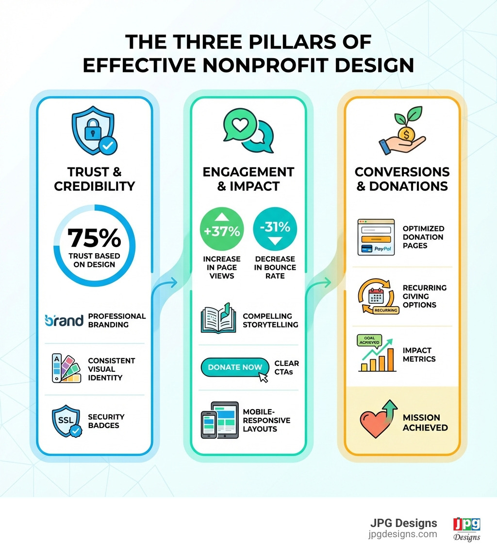
- Builds instant credibility – 75% of online consumers judge an organization’s trustworthiness based on website design
- Increases engagement – Well-designed sites see 37% more page views per session and 31% lower bounce rates
- Drives donations – Professional design directly impacts conversion rates on donation pages
- Communicates impact – Visual storytelling helps donors understand and connect with your mission
- Ensures accessibility – Inclusive design reaches all supporters, regardless of ability
Your organization’s design isn’t just about looking good. It’s about making your mission visible, credible, and actionable in a digital landscape where nonprofits compete for attention with every other cause, brand, and content creator online.
The challenge many nonprofits face is clear: limited budgets, small teams, and the pressure to prove every dollar spent drives impact. Yet research shows that 68% of nonprofits have redesigned their websites in the past three years, recognizing that strong design is no longer optional—it’s essential infrastructure for growth.
When design works, it becomes your organization’s most powerful advocate. It transforms complex issues into digestible stories. It turns casual visitors into committed donors. It builds the trust that converts one-time supporters into lifelong advocates.
But effective nonprofit design requires more than templates and good intentions. It demands strategic thinking about user experience, accessibility, mobile performance, and conversion optimization. It requires understanding that your website isn’t a brochure—it’s a dynamic platform for engagement, fundraising, and community building.
I’m Jeff Pratt, owner of JPG Designs, and over the past 15 years I’ve worked extensively with nonprofits, education organizations, and mission-driven groups to build accessible, modern websites that support critical communication and drive measurable results. Strategic design for nonprofits isn’t about aesthetics alone—it’s about creating digital systems that amplify your mission and convert supporters into action.
Quick design for nonprofits definitions:
The Foundation: Why Strategic Design is Your Mission’s Engine
At its heart, the primary goal of design for nonprofits is to empower your organization to achieve its mission. This means translating your purpose, values, and impact into a compelling visual and interactive experience that resonates with your audience. It’s about more than just aesthetics; it’s about creating a powerful, intuitive platform that inspires action, fosters trust, and ultimately drives positive change.
Strategic design helps us communicate our mission effectively by making complex information digestible and emotionally engaging. It builds trust by presenting a professional, transparent, and consistent image. In a crowded digital landscape, where countless organizations vie for attention, strong design helps us stand out, capture interest, and clearly articulate our unique value proposition. Without a solid design foundation, even the most impactful work can struggle to gain the recognition and support it deserves.

For more insights into why a well-designed website is crucial, explore our guide on the Importance of a Well-Designed Website for Nonprofits.
Communicating Your Mission and Impact Through Visuals
One of the most powerful ways design for nonprofits serves our mission is through effective visual communication. Our brains process images incredibly quickly—we can form an impression in as little as 13 milliseconds. This means visuals are often the first, and sometimes only, chance we have to connect with our audience.
Storytelling through design allows us to weave narratives that emotionally and visually connect with our audience. Instead of just stating facts, we can show the faces of those we help, the communities we serve, and the tangible results of our work. This creates an emotional connection that inspires empathy and encourages engagement. Authenticity is key here; using genuine photos and videos of real people and real impact builds a more credible story than stock imagery ever could.
Consider the Colorado Ballet. Their website is loaded with jaw-dropping, high-resolution images of dancers in action. These visuals immediately immerse visitors in the beauty and power of their art, effectively communicating their mission to perform world-class ballet. Similarly, impact reports, when designed thoughtfully with infographics and compelling imagery, can transform dry data into inspiring narratives that highlight our positive contributions.
As experts in Content is King: Creating High-Quality SEO Optimized Content, we understand that visuals are a critical component of any content strategy for nonprofits.
Building Trust and Credibility with Professional Design
Trust is the bedrock of any successful nonprofit, and professional design is a cornerstone of building that trust. A well-designed website and consistent branding convey professionalism and meticulousness, assuring potential donors and beneficiaries that our organization is well-managed and reliable. When our visual identity is fragmented or amateurish, it can inadvertently erode trust and suggest a lack of capacity.
Transparency, another vital component of credibility, can be significantly improved through design. Clear, organized layouts make it easy for users to find information about our finances, programs, and leadership. This openness fosters confidence. Consistency across all our platforms—website, social media, emails, and print materials—reinforces our brand identity and makes our organization instantly recognizable, creating a subconscious sense of stability and professionalism.
Security is also paramount. For any nonprofit handling sensitive donor information, a secure website is non-negotiable. An SSL certificate, indicated by “https://” in the website address, encrypts data and protects user privacy, which is visually communicated through browser indicators. This small design detail is a huge trust signal. The Dayton Foundation exemplifies a visually striking and professional platform, expertly designed to inspire community engagement and philanthropy, instilling confidence in its mission.
To ensure your website is secure and trustworthy, refer to our article on Why Your Website Needs an SSL Certificate.
Core Components of an Impactful Nonprofit Website
When we think about an impactful nonprofit website, we’re envisioning more than just a digital brochure; we’re creating a dynamic hub for our mission. The key elements work together seamlessly to engage visitors, communicate our story, and convert interest into action. These include an intuitive user experience (UX), clear navigation, compelling visuals, strategic calls-to-action (CTAs), and a highly optimized donation page. Each component plays a vital role in ensuring our website effectively serves our organizational goals.
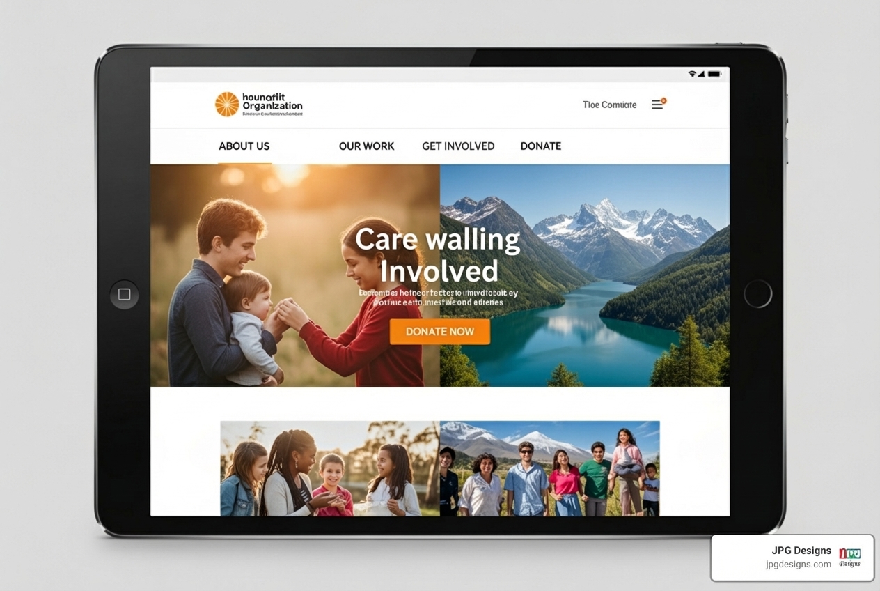
For a comprehensive look at essential website elements, check out our guide on 12 Design Elements Every Website Should Have.
Optimizing the User Experience (UX) and Navigation
User experience (UX) is the overall impression our visitors have when interacting with our website. For nonprofits, an optimized UX means that navigating our site feels effortless, logical, and even enjoyable. When users can quickly find what they need—whether it’s information about our programs, ways to get involved, or the donation page—they are more likely to stay, engage, and convert.
A simple, logical navigation structure is critical. Nonprofits often deal with complex issues and diverse programs, so our website’s menu shouldn’t reflect that complexity. Instead, we need to anticipate our visitors’ needs and create clear, concise menu categories. This helps in reducing our bounce rate, which for nonprofits can be as high as about 60% compared to around 40% for general websites. High bounce rates indicate that visitors are leaving quickly, likely because they can’t find what they’re looking for or the experience is frustrating.
Designing clear user journeys means guiding visitors through our site towards specific goals, such as making a donation or signing up for a newsletter. Mercy-USA provides an excellent example with its streamlined, intuitive design, using a clean layout with ample white space to make navigation easy and ensure key information is prominent. By focusing on a logical structure and user-friendly design, we create a positive experience that encourages deeper engagement.
Understanding the fundamentals of how users steer our site is paramount. Our guide on the Abcs Of Site Navigation: Importance And Best Practices offers further insights.
Crafting Compelling Calls-to-Action (CTAs)
Calls-to-Action (CTAs) are the signposts on our website that tell visitors what we want them to do next. For nonprofits, effective CTAs are not just about making a request; they’re about inspiring action and making it incredibly easy to participate in our mission.
Action-oriented language is key. Instead of vague phrases like “Click Here,” we should use compelling verbs that evoke emotion and urgency, such as “Donate Now,” “Volunteer Today,” “Join the Movement,” or “Learn How You Can Help.” The button design itself matters too. CTAs should stand out visually through contrasting colors, appropriate sizing, and clear, readable text. They shouldn’t be hidden but rather strategically placed where a user is most likely to be motivated to act.
Placement is critical. Prominent CTAs are often found in the header, at the end of compelling stories, or within sections that highlight our impact. However, effective CTAs aren’t limited to just donations. We should offer multiple engagement options, such as signing up for our newsletter, sharing our story on social media, or attending an event. This caters to different levels of commitment and allows visitors to connect with us in ways that feel meaningful to them.
Habitat for Humanity is a great example of a nonprofit that uses clear and compelling CTAs to encourage various forms of engagement, from donating to volunteering. They understand that every interaction, big or small, contributes to their mission.
To learn more about converting website visitors into supporters, check out our 3 Proven Tips to Improve Your Online Lead Conversions.
Best Practices for Your Donation Page
Our donation page is arguably the most critical page on our nonprofit’s website. It’s the moment our supporters translate their goodwill into tangible support. Therefore, it must be designed with utmost care to maximize conversions. A convenient, inspirational donation page is one that is simple, secure, and clearly communicates impact.
Simplicity is paramount. We should aim for a streamlined form with as few steps and fields as possible. Each additional field can introduce friction and lead to abandonment. Only ask for essential information. Security is equally vital; donors need to feel confident that their financial information is protected. Clearly display security badges and ensure our SSL certificate is active.
Encouraging recurring donations is a powerful strategy for sustainable funding. Offer clear options for monthly, quarterly, or annual gifts and highlight the cumulative impact of these ongoing contributions. Tying donation amounts to specific impact tiers can also be incredibly effective. For example, “$25 provides a meal for a family,” or “$100 funds a week of educational supplies.” This helps donors visualize the direct outcome of their generosity.
Oahu SPCA’s donation page stands out for its thoughtful design, including a picture of a cute animal and a reminder of their mission at the top, along with suggested donation amounts. Additionally, consider incorporating options for matching gifts, allowing donors to double their impact easily.
Actionable Strategies for Effective Design for Nonprofits
Moving beyond the core components, let’s dive into some actionable strategies that can lift our design for nonprofits and significantly amplify our impact. These strategies focus on deeply connecting with our audience, ensuring our message is accessible to everyone, and optimizing for how our users actually engage with our content.
At JPG Designs, we offer comprehensive Website Design Services custom to help nonprofits implement these strategies effectively.
Leveraging Storytelling to Drive Engagement
Storytelling is the emotional engine of nonprofit engagement. It transforms abstract problems into relatable human experiences, making our mission tangible and inspiring. Design plays a crucial role in bringing these stories to life.
We can use beneficiary stories to personalize impact, allowing individuals to share their experiences in their own words. This could be through dedicated blog posts, video testimonials, or even interactive features. buildOn’s blog does an excellent job of highlighting individual stories that describe the value of leading through service, inviting readers to join in. These personal narratives foster a deeper connection than statistics alone.
Impact narratives broaden the scope, showcasing the collective difference our organization makes. Design can visualize this through compelling infographics, timelines, and interactive maps. For instance, the Elton John AIDS Foundation features an informative global impact map, visually showcasing their reach and the areas where they are making a difference. Video testimonials add authenticity and a human voice, allowing supporters to hear directly from those impacted.
By integrating these storytelling elements throughout our website, we can transform casual visitors into engaged advocates who understand and believe in our cause. For more on crafting compelling narratives, see our Tactical Guide to Effective Content Marketing for Small Businesses.
Ensuring Accessibility for Every User
Accessibility in design for nonprofits isn’t just about good ethics; it’s often a legal requirement, especially under regulations like the Americans with Disabilities Act (ADA). An accessible website ensures that everyone, regardless of their abilities, can perceive, understand, steer, and interact with our content. This expands our reach and demonstrates our commitment to inclusivity.
We must adhere to Web Content Accessibility Guidelines (WCAG) standards, particularly Level AA, which is widely recognized as a benchmark for web accessibility. This involves several key design considerations:
- Screen Readers: Our website’s code must be structured logically so screen readers can accurately interpret and vocalize content for users with visual impairments.
- Alt Text: Every image and non-text element should have descriptive “alt text” so screen readers can describe the visual content.
- Color Contrast: Ensure sufficient contrast between text and background colors to make content readable for users with low vision or color blindness.
- Keyboard Navigation: All interactive elements should be navigable and operable using only a keyboard, accommodating users who cannot use a mouse.
- Clear Language: Use simple, straightforward language and avoid jargon.
The California Wellness Foundation is an excellent example of a nonprofit that prioritizes accessibility, conforming to WCAG Level AA standards with features like alternative text for images, sufficient color contrast, and logical headings.
For a deeper dive into making our website inclusive, read Why Your Website Should Be ADA Compliant.
Mastering Mobile-First Design for Nonprofits
A significant portion of our audience accesses information on their smartphones. Research shows that mobile users represent 52% of all visits to nonprofit websites. This isn’t just a trend; it’s the dominant way many people interact online. Therefore, embracing mobile-first design is no longer optional—it’s essential.
Mobile-first design means we prioritize the mobile experience during the design and development process, then scale up for larger screens. This approach ensures:
- Responsive Design: Our website automatically adjusts and displays beautifully on any device, from a small smartphone to a large desktop monitor.
- Touch-Friendly Navigation: Buttons and links are appropriately sized and spaced for easy tapping, preventing frustration for mobile users.
- Fast Load Times: Mobile users often have slower internet connections. Optimizing images and code ensures our site loads quickly, reducing bounce rates.
- Mobile-First Indexing: Search engines like Google now primarily use the mobile version of our content for indexing and ranking. A strong mobile experience directly impacts our search visibility and Google rankings, which is our expertise at JPG Designs.
By mastering mobile-first design, we ensure our message reaches our audience wherever they are, providing a seamless and engaging experience that encourages interaction and support. Our article on Responsive Web Design – Unparalleled Mobile Experiences provides more details.
Measuring Success and Choosing the Right Tools
Even the most beautifully designed website won’t achieve its full potential if we don’t know how to measure its effectiveness and adapt our strategies. For nonprofits, measuring success means understanding if our design efforts are truly contributing to our mission. This involves leveraging analytics, setting clear Key Performance Indicators (KPIs), and choosing the right Content Management System (CMS) and community engagement tools.
At JPG Designs, we specialize in Digital Marketing Services that help nonprofits track, analyze, and optimize their online presence for maximum impact.
How to Measure the Success of Your Design
Measuring the success of our design for nonprofits goes beyond counting website visitors. We need to look at how design influences user behavior and ultimately, our organizational goals. Here are some key metrics we track:
- Conversion Rates: This is crucial for nonprofits. We measure how many visitors complete desired actions, such as making a donation, signing up for a newsletter, or registering for an event. An increase in conversion rates often indicates effective design.
- Bounce Rate: As mentioned earlier, a high bounce rate (around 60% for nonprofits) suggests users are leaving quickly. A well-designed, engaging site should see a decrease in this metric.
- Time on Page: This metric indicates how long users spend on specific pages. Longer times often suggest that content is engaging and that our design is effectively presenting information.
- Donation Volume and Value: Directly tracking the number and total value of donations made through our website provides clear evidence of our design’s fundraising effectiveness.
- User Engagement: Beyond direct conversions, we look at metrics like page views per session, clicks on internal links, and social shares to understand overall user interaction.
Tools like Google Analytics are indispensable for gathering this data. By regularly reviewing these metrics, we can identify what’s working, what’s not, and make data-driven decisions to continuously improve our website’s design and performance. For comprehensive guidance, refer to our article on Everything You Need to Know About Google Analytics.
Choosing a Content Management System (CMS)
The right Content Management System (CMS) is the backbone of our nonprofit website, empowering our team to manage and update content without extensive technical knowledge. The choice of CMS significantly impacts ease of use, scalability, and the ability to implement effective design.
Some CMS platforms are built specifically with nonprofit needs in mind, offering features like integrated donation forms, volunteer management tools, and impact reporting functionalities. These “nonprofit-specific CMS” options can simplify operations and reduce the need for custom coding.
Alternatively, powerful and flexible platforms like WordPress are widely used by nonprofits. WordPress offers a vast ecosystem of themes and plugins that can be customized to suit almost any need, providing great scalability as our organization grows. For example, while the Bill & Melinda Gates Foundation uses Sitecore, a highly customized CMS, many smaller and mid-sized nonprofits find WordPress to be an excellent balance of functionality and affordability. The key is to choose a CMS that is easy for our team to use, allows for the design flexibility we need, and can scale with our mission.
Frequently Asked Questions about Design for Nonprofits
Navigating design for nonprofits can bring up a lot of questions. Here, we address some of the most common inquiries to help you on your journey.
How can a small nonprofit with a limited budget improve its design?
Even with a limited budget, a small nonprofit can make significant design improvements. Our focus should be on clarity, simplicity, and authenticity.
- Prioritize the essentials: Ensure our mission, how to donate, and how to contact us are immediately visible.
- Use authentic photos: Instead of expensive stock photos, use high-quality, genuine images of our work, volunteers, and beneficiaries. These build more trust and emotional connection.
- Mobile-friendly layout: Many free or low-cost website builders offer responsive templates. Ensuring our site looks good and functions well on mobile is crucial.
- Prominent “Donate” button: Make it easy for people to give. A clear, consistently placed donate button is non-negotiable.
- Leverage free design tools: Platforms like Canva offer free templates for social media graphics, flyers, and even basic infographics, allowing us to maintain a consistent brand identity without hiring a designer for every piece.
- Focus on clear, concise messaging: Good design supports good content. Ensure our text is easy to read and understand.
Creativity in design doesn’t always require a hefty budget; it often requires strategic thinking and resourcefulness.
What is the single most important design element for a nonprofit website?
While many elements contribute to an effective nonprofit website, we would argue that the single most important design element is a clear and compelling Call-to-Action (CTA), especially for donations.
A well-designed CTA guides visitors directly to the action we want them to take. It needs to be visually prominent, use action-oriented language, and be strategically placed. Without a strong CTA, even the most inspiring stories or beautiful imagery might not translate into the tangible support our mission needs. It’s the bridge between inspiration and impact, directly driving our fundraising goals and other engagement objectives.
How often should a nonprofit redesign its website?
The digital landscape evolves rapidly, and our website needs to keep pace. Generally, we recommend a major website redesign every 2-3 years. However, this isn’t a hard and fast rule; the need for a redesign is often prompted by several factors:
- Outdated Aesthetics: If our website looks old or unprofessional, it can erode trust.
- Poor Performance Metrics: High bounce rates, low conversion rates, or slow load times are strong indicators that a redesign is needed.
- Changes in Mission or Programs: If our organization’s focus has shifted significantly, our website should reflect those changes.
- Technological Advancements: New web standards, security requirements, or mobile responsiveness issues can necessitate an update.
- Rebranding: A new logo or brand identity almost always requires a website refresh to maintain consistency.
The good news is that we’re in good company: according to a Nonprofit Tech for Good report, 68% of nonprofits have redesigned their websites in the past three years. This shows a clear recognition across the sector that continuous improvement of our online presence is vital for sustained impact.
Conclusion: Transform Your Mission into a Movement
Effective design for nonprofits is more than just a visual improvement; it’s a strategic imperative that transforms our mission into a powerful movement. By embracing thoughtful design, we build trust, communicate our profound impact, and inspire our audience to take meaningful action. From compelling storytelling and accessible user experiences to mobile-first optimization and data-driven insights, every design decision contributes to our ability to connect, engage, and ultimately, make a difference.
At JPG Designs, we understand the unique challenges and immense potential of nonprofit organizations in Rhode Island and Massachusetts. Our expertise in professional web design, SEO optimization, and mobile-first strategies ensures that your digital presence not only looks exceptional but also performs powerfully, driving engagement and furthering your vital cause. We’re committed to helping you create a website that truly reflects your passion and amplifies your impact.

